Route Comparison
Problem Statement
Two (or more) routes get me from A to B, which Route is the smartest choice for me now?
This problem statement arose from feedback our team received around users having issues around fixed route discoverability in our mobile app.
Research Approach
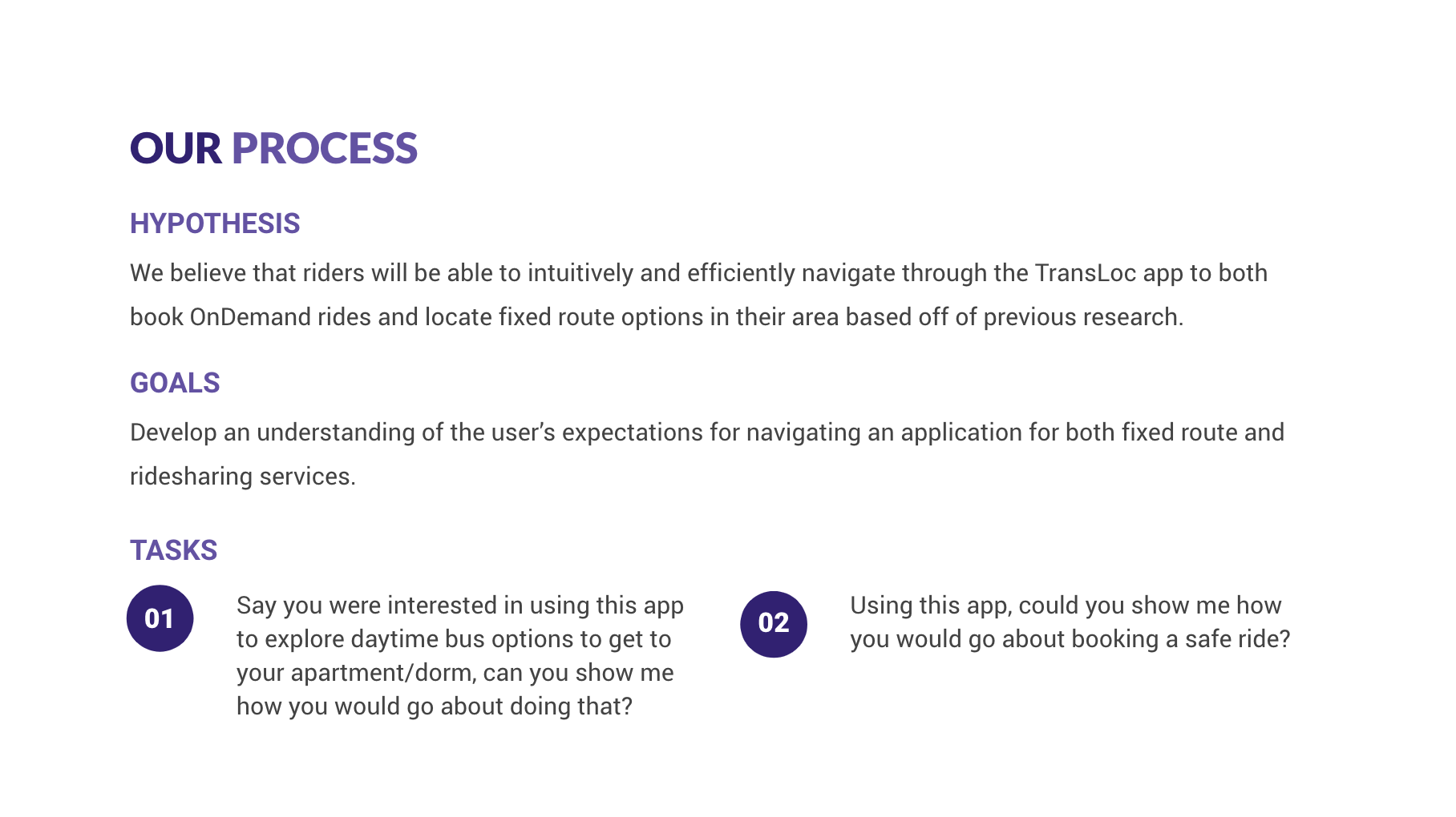
We knew that for such a large problem statement, the best way to measure the success of our prototype would be by doing usability testing with students in a campus setting.
usability testing
We visited 3 different campuses and tested the prototype with 27 participants to see if users were successful in completing the tasks around discoverability.
Findings
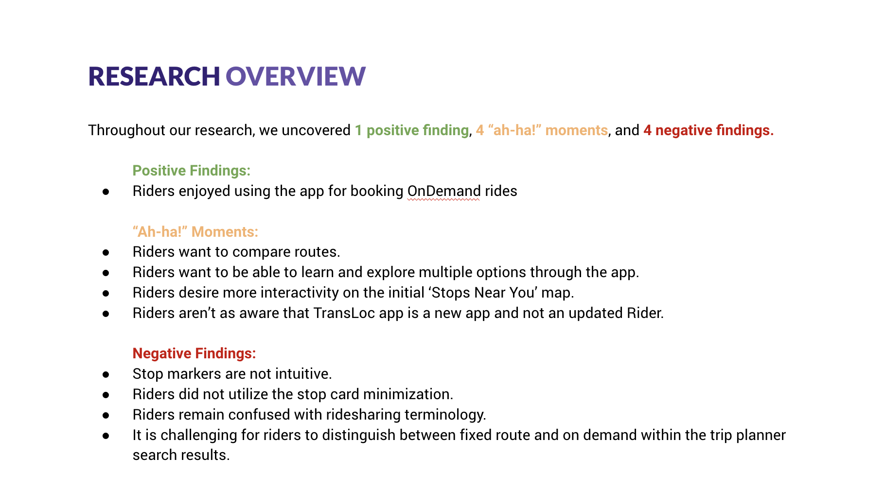
Our research provided a lot of insights into what currently wasn’t working in the app, what people found usable in the prototype, and that we were operating off a long standing assumption that users (riders in this case) cared about viewing stops nearest them before routes; they actually cared about routes first and then stops.
the insight we didn’t expect
In the current experience, our users had to explore stops before they were able to discover routes. But our research showed consistently that they care about comparing routes as a whole first and then picking which stop along that route works best for them in that moment.
Other Existing Functionality
Knowing we had to re-do the fixed route workflow, we considered taking the same direction that Rider does- our other application that’s focused around fixed route. However we saw enough issues with the interface that we knew we could improve the user experience while also keeping the UI much simpler.
Designing for the Transit Novice and VETERAN
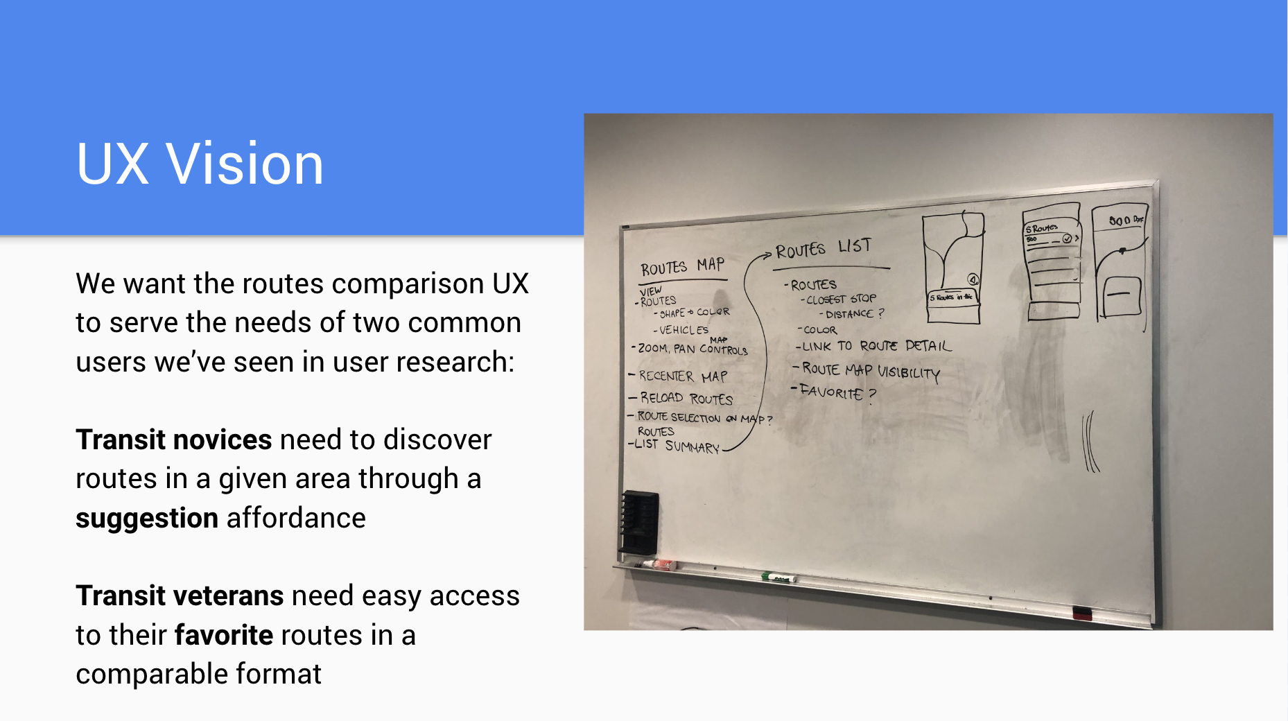
Through our research we knew we needed to surface a route comparison experience on initial load. But while designing we also wanted to keep in mind the idea of designing for 2 different types of users: the transit novice who is using the app to discover routes in a certain area and might need suggestions of which route is best for them, and the transit veteran who is familiar with the route options available but really only cares about a few that are relevant to them.
Map and List Pattern
We decided that the best experience moving forward would be to work off of an established design pattern, a map and corresponding list pattern. We felt confident that users would be able to connect the list and map together since this is seen in popular apps such as Yelp, Airbnb, and of course, Google Maps. Keeping in mind to not clutter the UI or overwhelm the user, we wanted to give them an affordance to turn off suggested routes (and just choose favorites), and an affordance to slide the list down (to a minimized state) to be able to have more screen real estate to interact with the map.


